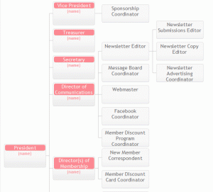
Another project I’ve been working on recently was an online org chart to show the leadership structure for my mom’s club. One of the leaders sent me a powerpoint version of the chart and said “we want this on the website”.
I was anticipating this document would change over time, as new roles are created or subdivided and old roles are retired, so I wanted to make the update process straightforward and quick, so I wasn’t too keen on using an image for the chart.
My first thought was to use Google Orgchart, as it’s super-easy to set up, and I could have the whole thing done in five minutes or so, and there initially appeared to be a section on customizations. But then when I started digging into the options, it turns out there’s no option to change the orientation to go left to right instead of top to bottom, which ended up being a deal-breaker. To illustrate why, here’s a demo of what Google Orgchart’s output looks like with a shallow but wide tree:
 In reality, there are 2-5 coordinators under each director role, and a few of those have as many as 3 assisting roles beneath that, so the actual chart would have been much wider. I just wanted to show you how having horizontal labels on a wide chart without putting children far enough down to scrunch the previous level results in a hard to read chart. For a deep hierarchy with few nodes, Google Orgchart seems like a great simple tool, but for a shallow hierarchy with many nodes per level, it just wasn’t the right tool.
So I started looking into alternatives to Google Orgchart. There was absolutely nothing with the same level of simplicity. At one point I even looked into how hard would it be to just export the powerpoint chart to HTML. Oh, but it turns out Office took “export to html” out of the features list in Office 2010, so I would have had to reinstall Office 2003, or experiment with a rather complex workaround, just to evaluate whether that would be a feasible choice.
In the end I kept coming back to suggestions that Basic Primitives looked like the right tool for the job. It’s demos clearly showed it was capable of a horizontal layout, but unfortunately, their “how to use” section completely neglected to give a demo on how to change that option. The tool provides lengthy documentation on all the properties you could possibly set, however, the “reference guide” looked like a machine-generated documentation, and I felt like the “how to” section could have been a little more helpful at explaining how to use the different customization options, rather than leaving that as an exercise to the newbie who has no idea how to use this tool.
It took a a bit of time studying the examples they did provide, and trying to match up how they changed this and that to where in the reference guide that item was documented to figure out how to decipher the reference guide. But in the end, I was successful in creating the org chart I needed using this tool.
Here’s an image of what the layout ended up looking like using the basic primitives tool with custom (simplified) layouts for each role. The colors are designed to coordinate with the site ;-).
 In my next post I’ll spell out a little more about how to use Basic Primitives because it’s a great tool, but the documentation isn’t very newbie friendly.

If you are looking for an alternative to Google Orgchart, I would recommend checking out lucidchart. Through their site, I learned how to make an org chart in powerpoint and it was very easy to use!
Hi Karran,
I would like to contribute some organizational chart templates from the community to those who are looking for org charts of many scenarios. You can edit and use them to create your diagrams freely.